
Table of Contents
Y241206 / A review of stock price activity charts and the misjudgments they inspire /
A simple stock price activity chart will not fully illustrate several aspects of common stock ownership (dividends, M&A, spinoffs, stock issuance and repurchases, etc.) that drive an outsized portion of total return to an investor over time.
An analyst must make detailed and careful adjustments to any stock price chart or time series to fully reflect the total return to an investor. The necessary adjustments require analytical judgement and importantly, need to be customized to an exact start date and executed price (and executed reinvestment prices) to determine the total return to a long-term shareholder.
1 Items Ignored in a Simple Unadjusted Price Chart
The following corporate actions are often not fully captured in a simple unadjusted price chart
- Cash dividends, particularly if reinvested
- Mergers, acquisitions and spinoffs
- Share issuance or repurchase
- Stock splits and reverse splits (many price activity charts available online do capture splits – but be sure to verify)
For illustration of the wild discrepancies in total return due to corporate action, please see the General Electric illustration below.
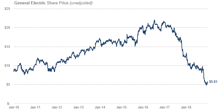
2 Total Return: General Electric (now GE Aerospace)
An investor could have seen the steep decline in General Electric’s stock price, the reshuffling of management, and the troubling outlook as a good buying opportunity. On January 1, 2019 they would have seen the following chart and could have purchased 1,000 shares of common stock for $5,810.
Subsequently after the investment, they would do absolutely nothing more than infrequently inspect the company’s financials and listen to what management has to say on periodic earnings calls.
Despite the available dividends being quite thin (>1.0%) and the price activity offering the same price per share (and lower) for periods well into 2022, the investor would be paid handsomely for doing essentially nothing.
After a 1 for 8 reverse split, several other corporate actions, and a renaming to GE Aerospace, the investor would have looked at the below chart on December 5, 2024.

The price activity appears to have reached previous highs, last seen in the 2016-2017 timeframe. That is only a very small part of the story, as the total return to the long term investor is not captured by just this chart.
Corporate actions affecting the long term shareholder:
- Jan 1, 2019 – Purchase 1,000 share @ $5.81 (120 shares @ $48.31 adjusted for reverse split)
- Feb 25, 2019 – Spinoff and merger with WABTEC – thereafter renamed Westinghouse Air Brake Tech. (+5.4 WAB shares)
- Feb 26, 2019 – 104-for-100 stock split on GE Shares (+40 GE shares)
- FY 2019 – 0.2% Cash dividends reinvested in GE and WAB
- FY 2020 – 0.2% Cash dividends reinvested in GE and WAB
- Aug 2, 2021 – 8:1 Reverse stock split on GE Shares (now ~130 GE shares)
- FY 2021 – 0.2% Cash dividends reinvested in GE and WAB
- FY 2022 – 0.2% Cash dividends reinvested in GE and WAB
- Jan 4, 2023 – Spinoff GE HealthCare (GEHC +84 shares)
- FY 2023 – 0.2% Cash dividends reinvested in GE, WAB, GEHC
- April 2, 2024 – Spin of GE Vernova (GEV) power businesses and GE renamed GE Aerospace (GEV +33 shares)
- FY 2024 – 0.1% Cash dividends reinvested in GE, WAB, GEHC
The real money is in waiting.
As a reward for patiently waiting and doing nothing, the long term investors return is materially higher than simply the nominal gain on the GE shares.
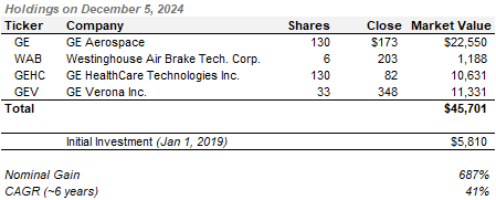
Total return to the long term investor is nominally 687% or a CAGR over 6 years of 41% (ignoring taxes). The total return illustrated by just the GE price chart would only be 288% or a CAGR over 6 years of 25% ($5,810 initial investment with $22,550 market value as of Dec 5, 2024).
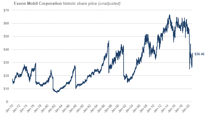
For illustration of the wild discrepancies in total return due to dividends and share splits, please see the Exxon Mobil illustration below.
3 Total Return: Exxon Mobil Corporation
Exxon Mobil: Historic Share Price (Unadjusted) from Jan 1970 to Dec 2020
Exxon Mobil: Historic Share Price (Adjusted for splits and dividend reinvestment) from Jan 1970 to Dec 2020
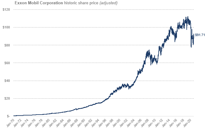
The adjusted chart above is much closer to ‘economic reality’ for the long-term investor. This captures the hundreds of dividends paid (and reinvested), five share splits and several acquisitions and mergers.
4 Price Charts Say Nothing About the True Returns to an Investor
This is not a new observation, but we believe it is critically important for an investor to understand and appreciate, particularly in the 21st century.
To illustrate that this is not a new observation, please see the below quote from Edgar Lawrence Smith written in 1925 in Common Stocks as Long Term Investments. This book is one of Yield to Best’s most cherished readings.
“…The usual data and charts representing market fluctuations of common stocks are of no value … as they disregard stock dividends, the sub-division of shares, securities of different character given in exchange, and all the other changes in the form of holdings which would come to an actual investor in common stocks who retained the capital distributions on his original holdings throughout an indefinite period of time… The gravity of the mistaken view which may result from the publication of such charts has been realized for some time by economists but owing to the unpopularity of a more abstract presentation of stock market movements, it is only recently that the Standard Daily Trade Service has made the decision to change the basis of its stock market charts…”
COMMENT: YTB believes it is of critical importance for investors to fully appreciate this fact, particularly today, because the proliferation of digital networks, the ubiquity of mobile devices, and the velocity of stock market data expansion has bombarded the average investor with somewhat misleading data. In effect, every human has a casino run on a supercomputer in their pocket, with nearly 24/7 price activity data down to the penny (or further). The excitement and rush these charts can deliver to a gambler is akin to a scheduled substance. The complexity involved in calculating a total return measure for all securities, over all time horizons, is not a realistic nor helpful solution. Investors must be aware of the items not captured in a simple price chart and should use this information in all judgements and decisions moving forward.
